Thank you for exploring my website. Personally, it’s fun for me to look back on older work. I see goals accomplished mixed with learning moments. I don’t post these for sentimental reasons or to claim historical significance. I only hope that they spark new ideas from students and emerging designers.
- Doug May
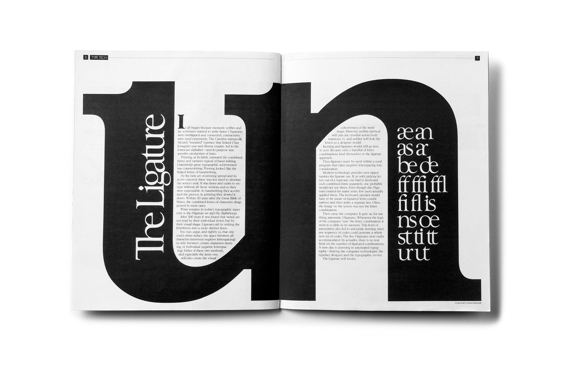
Tom Carnase is a master of the letterform. His pedigree as a mentee and partner of Herb Lubalin gave me firsthand experience of the demands of achieving typographic excellence. While at Carnase Design, I worked on projects, including annual reports, consumer packaging, identity programs, and editorial assignments. My first few years out of Art Center working with Tom was like earning a master’s degree in typography. The New York Art Directors Club and TDC gave awards for this spread in Ligature Magazine.
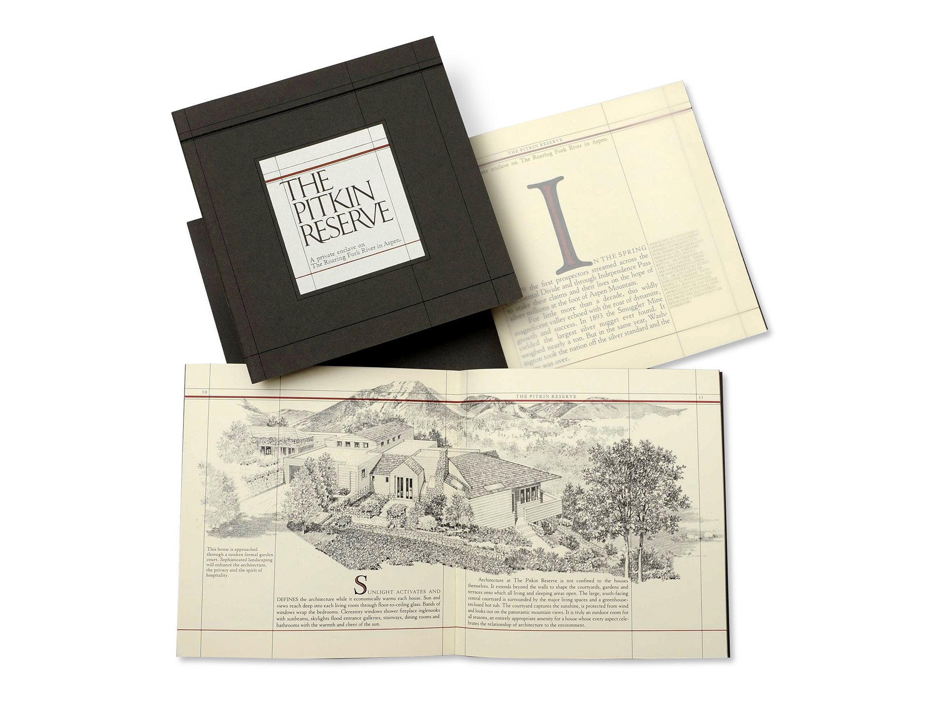
Then there’s Roger Black, an art director who has designed more magazines than anyone else on the planet. Occasionally Roger would be commissioned for projects other than a periodical. That’s where I came in. Roger not only taught me about typography but also sparked my entrepreneurial spirit. This project is unique, but most notably, the typography was handset metal type. The cover is a combination of letterpress over silkscreen on imported cover stock. The brochure pictured above is for a private enclave in Aspen, Colorado. The craftsman effort was recognized by Communication Arts and by the Type Directors Club.
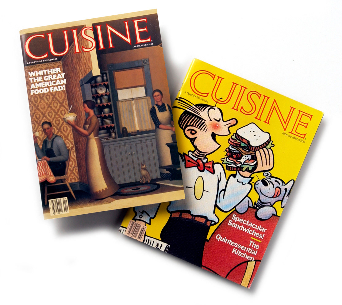
I learned a great deal from Mary Shanahan, Art Director at CBS Magazines. While at Cuisine, I worked on features with chef Jacques Pepin, wine expert Hugh Johnson, art director George Lois, and many outstanding photographers and illustrators. I also gained 10 pounds sampling daily from the test kitchen.